
University of Findlay Symposium Posters
Challenge
Create a poster that represents the University of Findlay's Symposium for Scholarship and Creativity event, where students from each college were allowed to share their research, creativity, and professional learning experiences. Come up with concepts that represent all six of the University's Colleges: College of Business, College of Education, College of Health Professions, College of Pharmacy, College of Arts, Humanities, and Social Sciences, and College of Sciences, and bringing them together in one design.
Solution
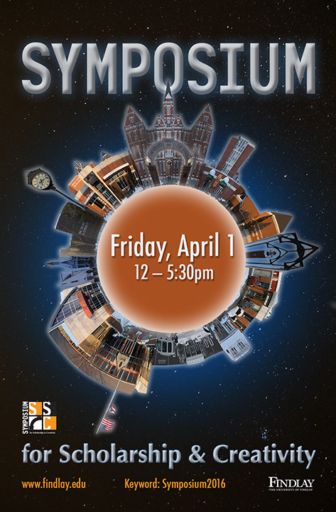
For the left design, through photography, I captured the campus school buildings, and combined them in Photoshop to create a miniature world emphasizing the most recognizable parts of the University of Findlay. The idea behind this was to illustrate how each aspect of the University makes up the entire, unique campus. Each college brings their own talents to the table. This was chosen as the runner-up, and was featured in the University of Findlay's Juried Student Art Show.
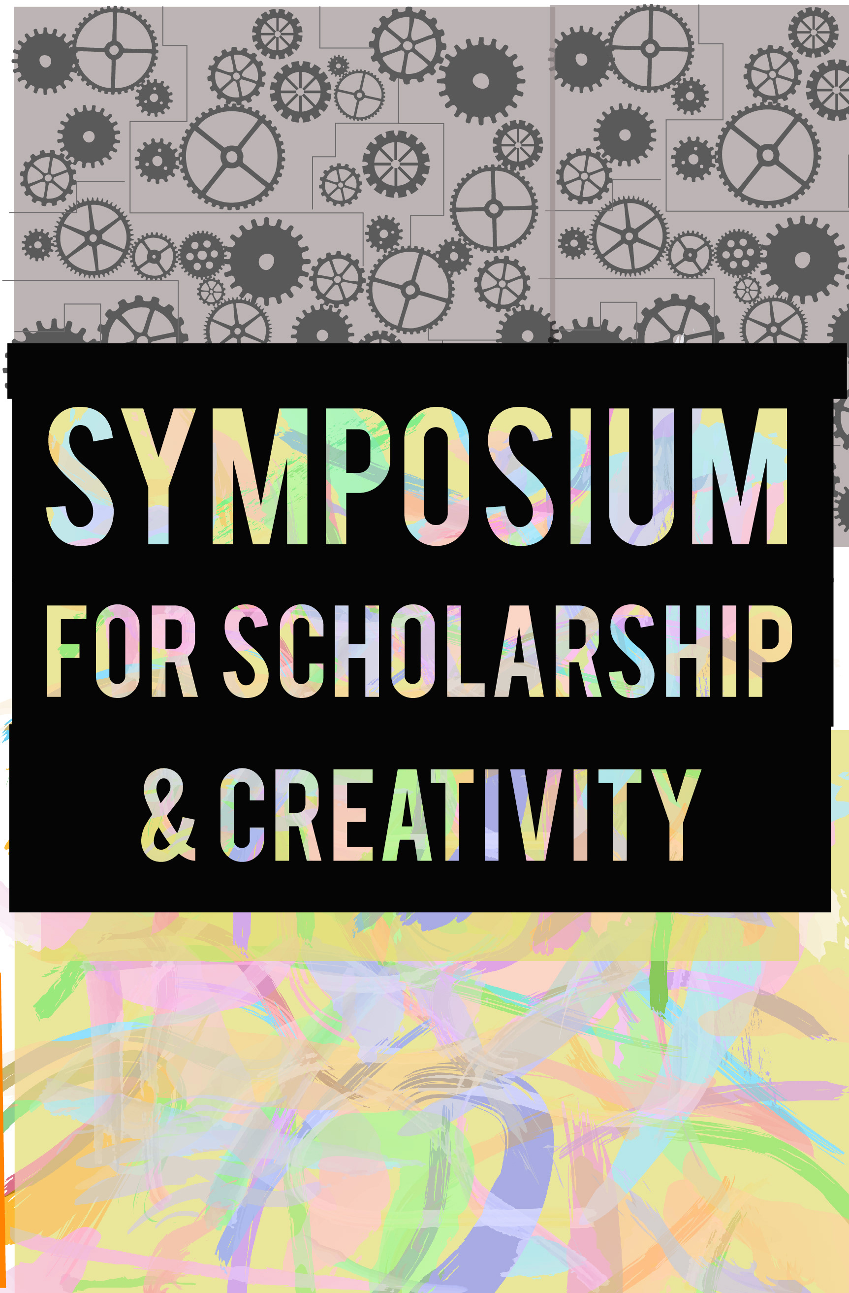
While the middle design is a draft, this concept shows the two basic representations of the types of colleges: artistic and creative versus analytical and methodical.
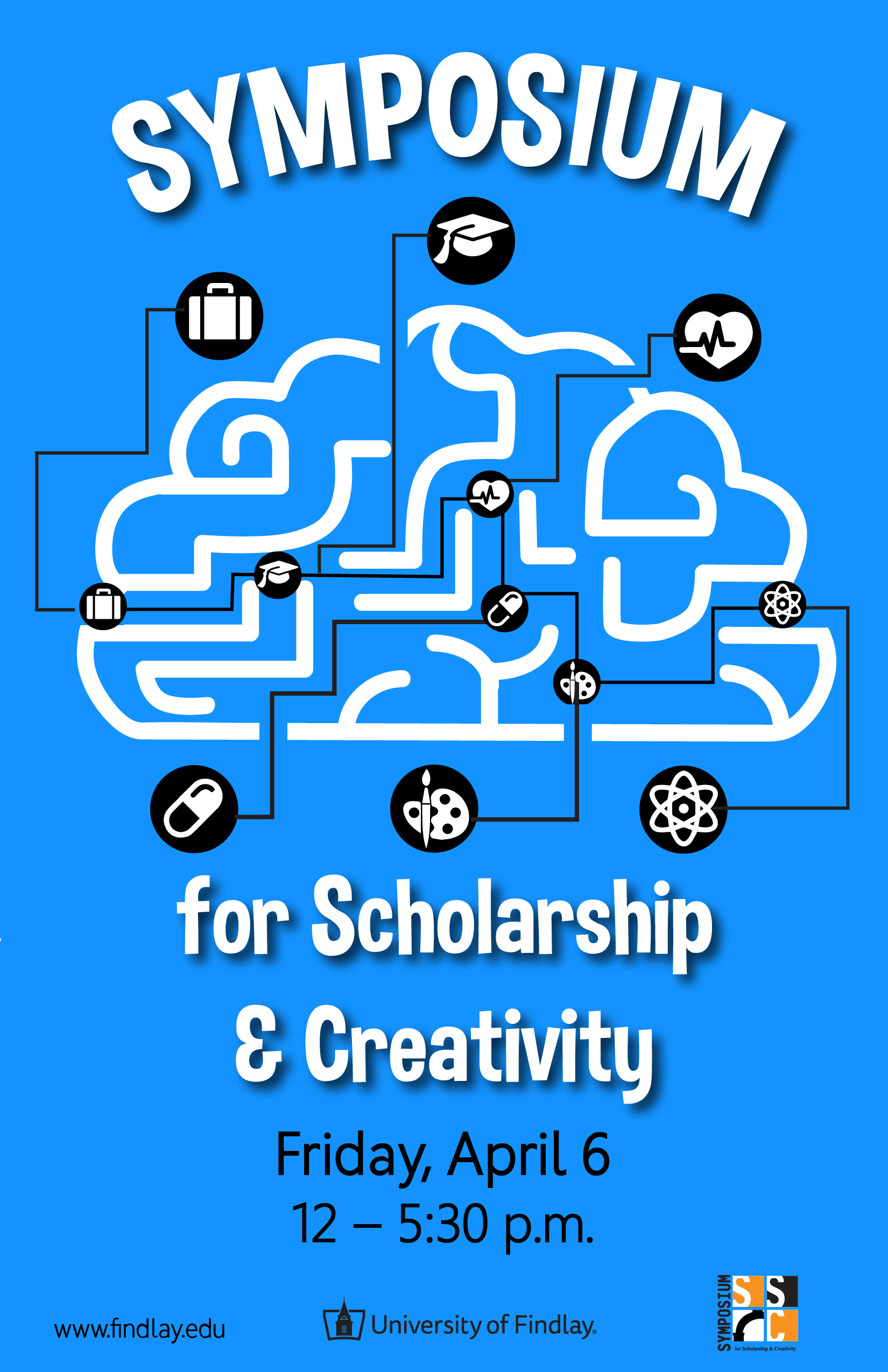
The design on the right was chosen for 2018. I created icons to represent each college, showing a brain as a maze they must migrate through. This highlights the different parts of the University collectively working, while having a separate place in the brain.
Magazine Covers
Challenge
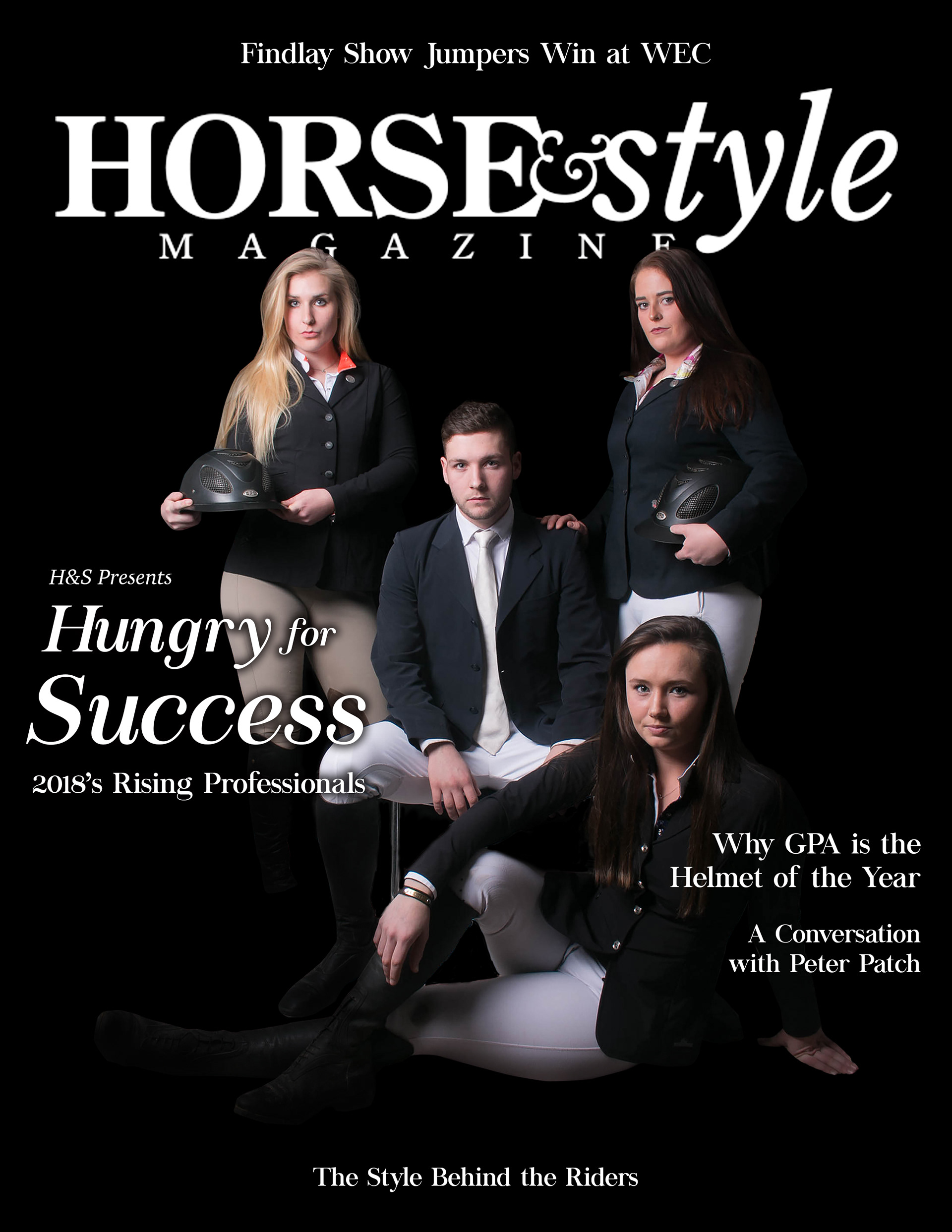
Horse & Style: This was a photography class assignment to create a promotional photo using studio lighting.
Solution
Being the equestrian that I am, I gathered my friends from the barn and created a dramatic photo representing the style and attitude that encompasses the high class Hunter/Jumper world. I finalized this design by turning it into a magazine cover based on Horse & Style magazine.
Challenge
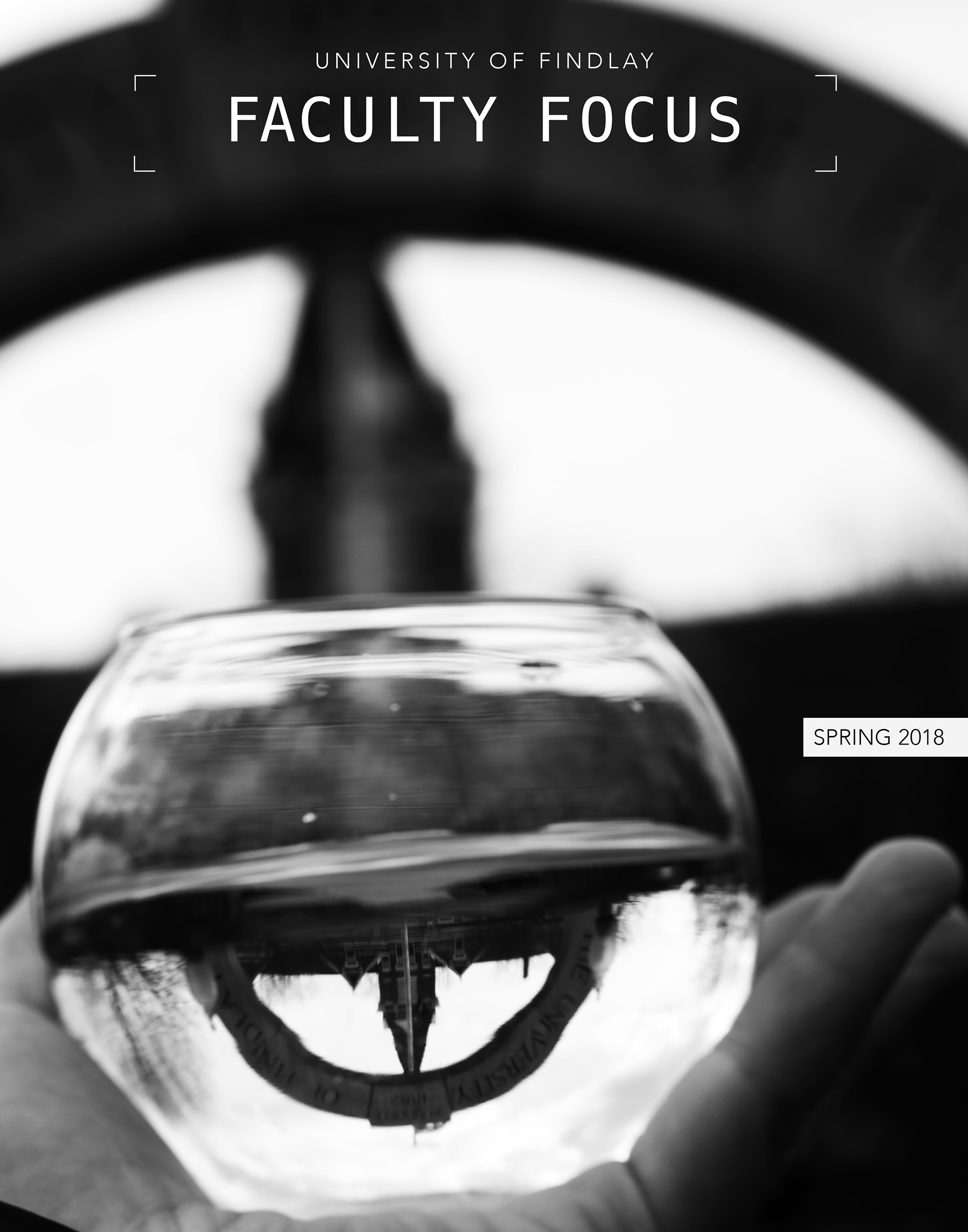
Faculty Focus: This was a project for my internship for the University of Findlay Marketing Department. The goal was to find a unique way to play on the "Faculty Focus" title.
Solution
I wandered around campus with my camera, playing around with aperture and different focus points. I brought some props with me, including the glass of water featured in the image and a magnifying glass. I experimented with different angles, laying on the ground holding up this glass in front of the arch, until I got this shot of the Old Main building and the arch in the water reflection, with the actual arch blurred in the background.
Book Cover

Challenge
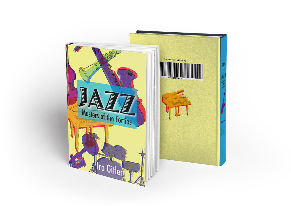
This was a class assignment to create a book cover for the book titled Jazz Masters of the Forties.
Solution
I researched the history of jazz music to understand the essence of this book. I found that jazz is very lively and robust, full of rhythm and improvisation. I used Illustrator to create different jazz instruments. To add life to them, I created a duplicate effect symbolizing movement. Using loud, bright colors, I made a collage of the instruments representing how they work together in harmony, while improvising and overlapping each other. I wanted to create a book cover showing how vibrant, in your face, and interesting jazz music can be.
Cancer Patient Services Brochure

Challenge
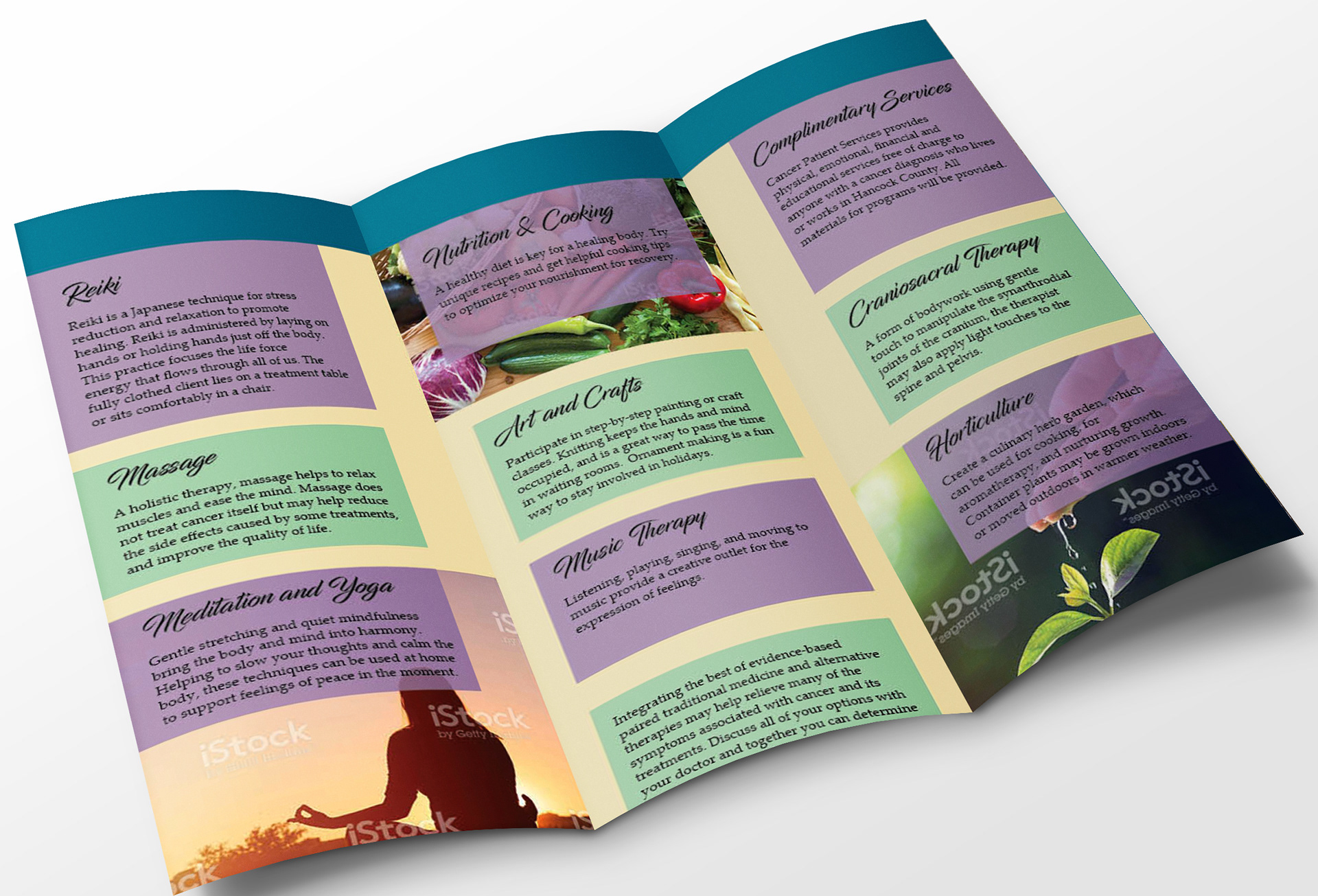
This was a class assignment to create a brochure for Cancer Patient Services, sticking to their brand standards.
Solution
I researched the client to find out what type of mood this brochure should have. Since the brochure is for cancer patients, I used calming pastel colors and images of nature and meditation to create an aesthetically pleasing brochure that provides the information clearly. This was created in InDesign.
Client Work
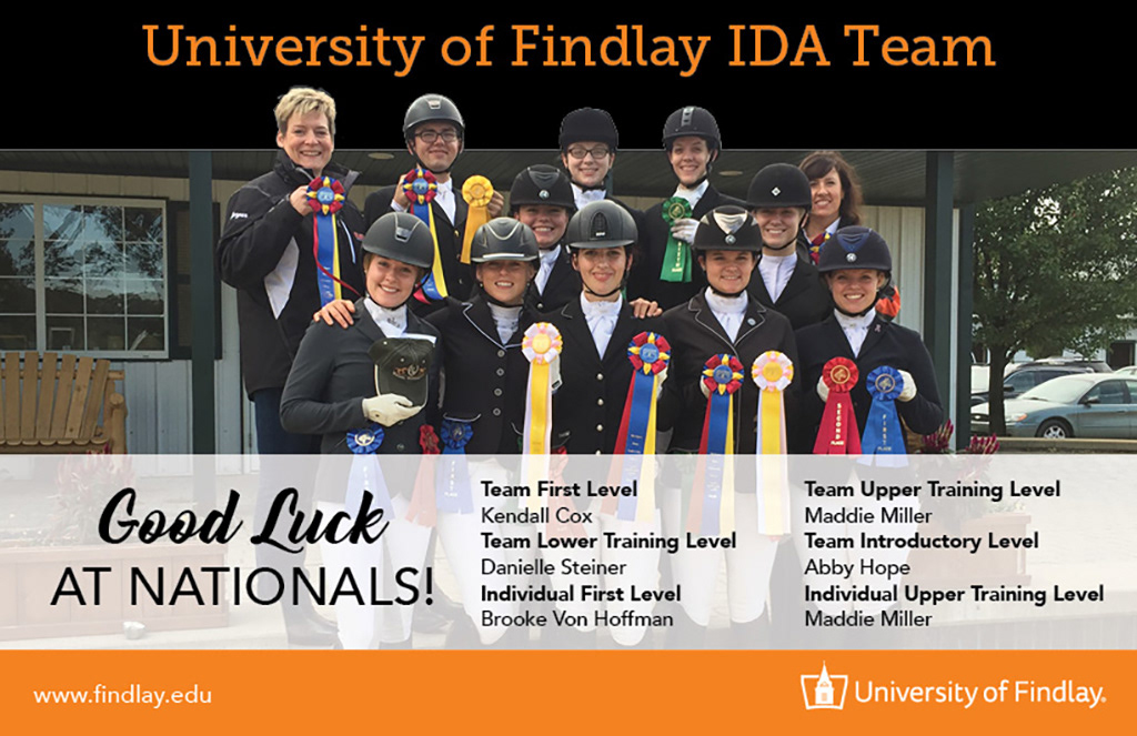
Magazine ad wishing the University of Findlay's Dressage Team luck at IDA Nationals. This was created using Photoshop and InDesign.

Postcard created during my internship with Blanchard Valley Health Services. This was created using Photoshop and InDesign. This is an example of how I inject my personal style into my work, while still adhering to brand standards.
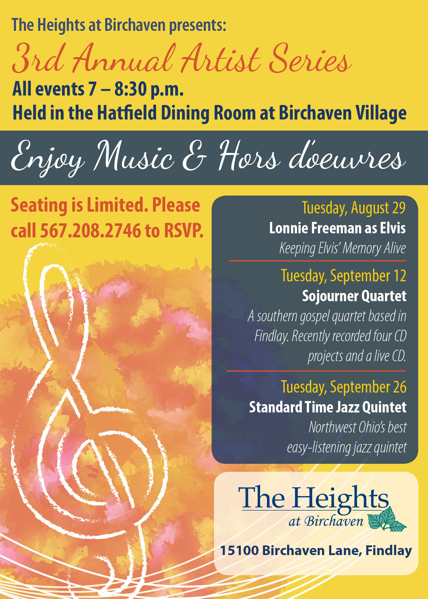
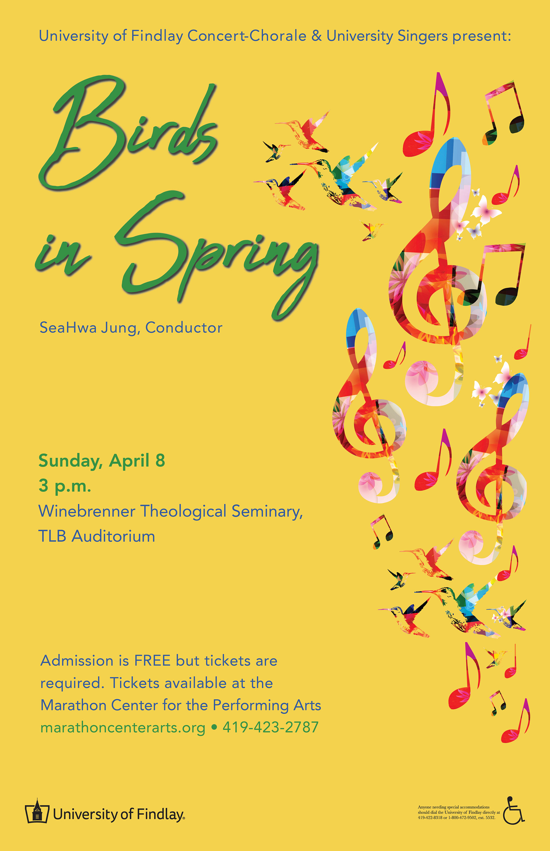
Poster created for my internship with Blanchard Valley Health Services using InDesign.
Poster created for my internship with the University of Findlay Marketing Department using InDesign.
Menu Design
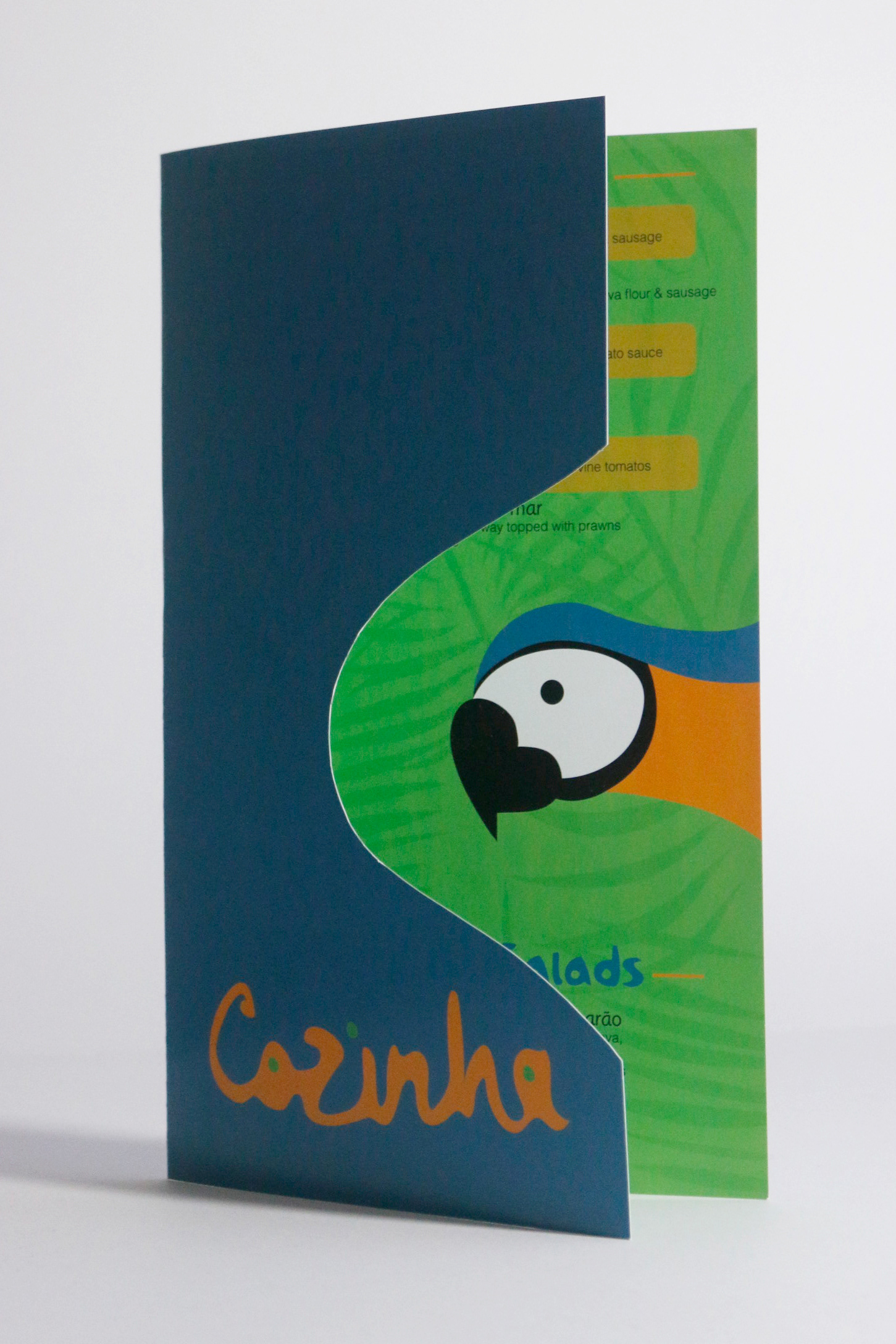
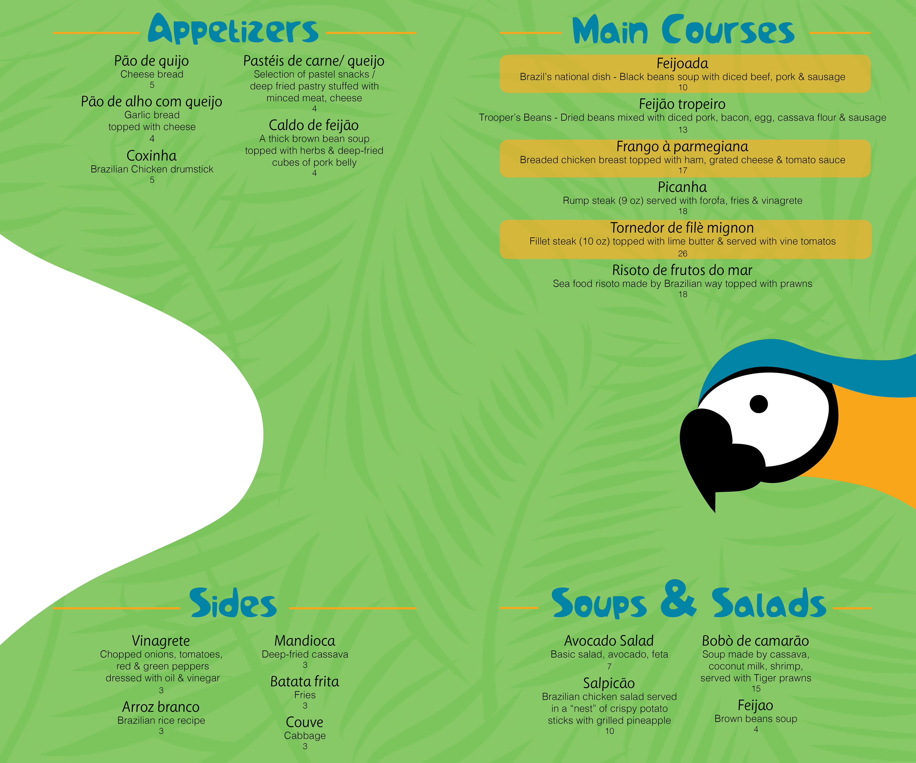
Challenge
Class assignment to create a restaurant menu for a Brazilian restaurant.
Solution
I researched Brazilian food and the culture in Brazil. Using the colors of the Brazilian flag, I created a menu that represents the tropical climate of Brazil. The palm tree pattern was created using Illustrator, and the menu design was made in InDesign. To make the menu unique, I designed it with a cutout in the front, allowing the parrot to be seen underneath. Overall, I wanted a lively, vibrant menu inviting the viewer in to taste the unique Brazilian food.
Word Art
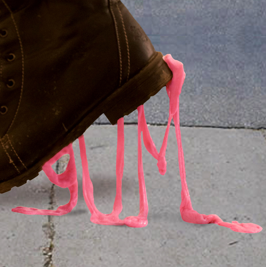
Challenge
Class assignment to create word art. After choosing a word, we had to figure out how to represent that word using the material of the word itself.
Solution
I chose the word 'gum', so I actually used real gum to spell the word out. I used a can to elevate the shoe, put tape on the bottom of the shoe so the real gum wouldn't stick, and stretched out the chewing gum, arranging it to spell out the word. After I photographed this setup, I used Photoshop to add a new background.
DVD Cover
Challenge
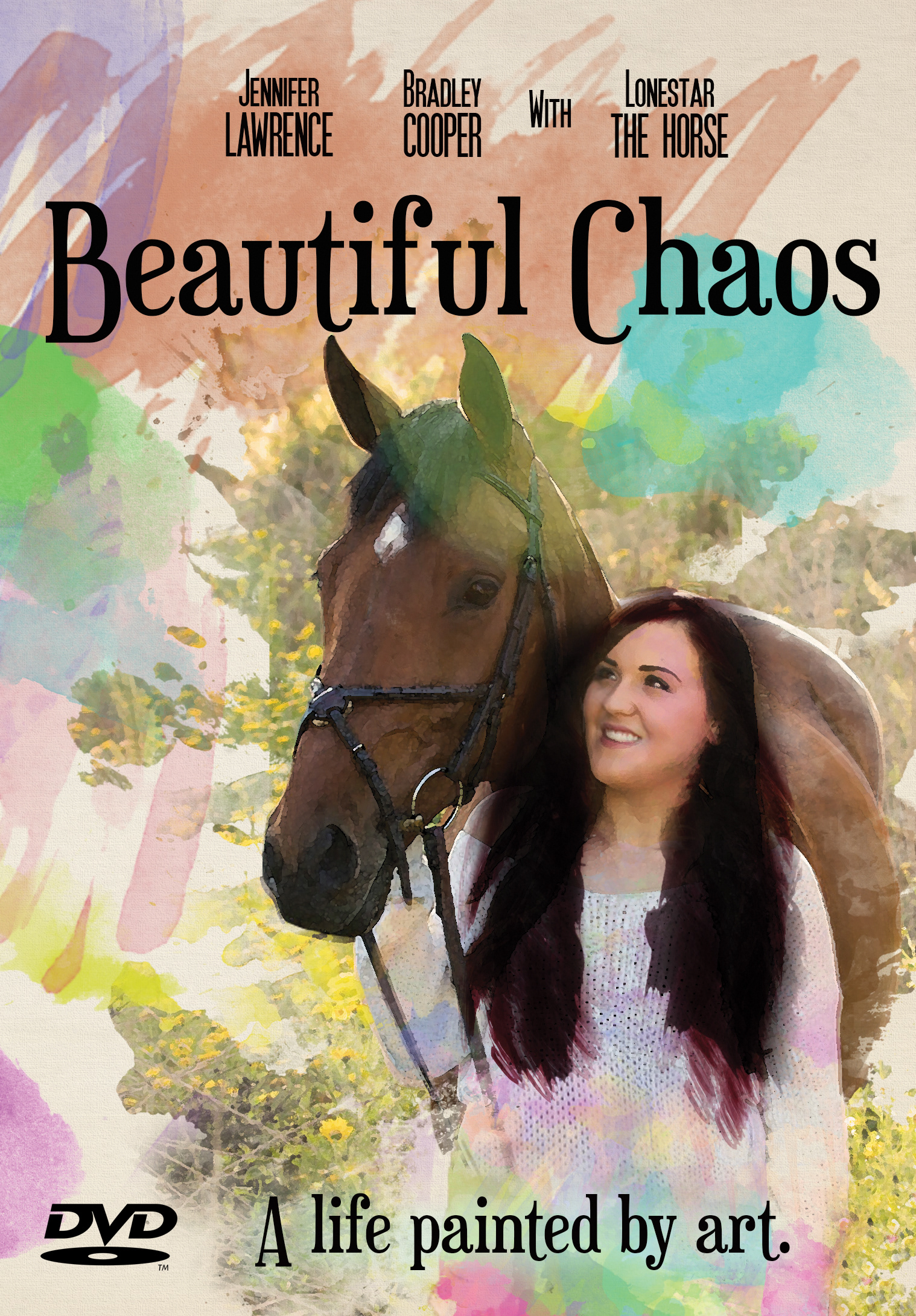
Class assignment to create a DVD cover with a self portrait that represents your life.
Solution
My life consists mostly of horses and art. At the time, I was double majoring in college and was constantly busy with classes, design projects, and horse showing, so "Beautiful Chaos" was a pretty accurate title for my life then. I used Photoshop to add a watercolor effect to a picture of me with one of the horses I used to have.
Packaging Design
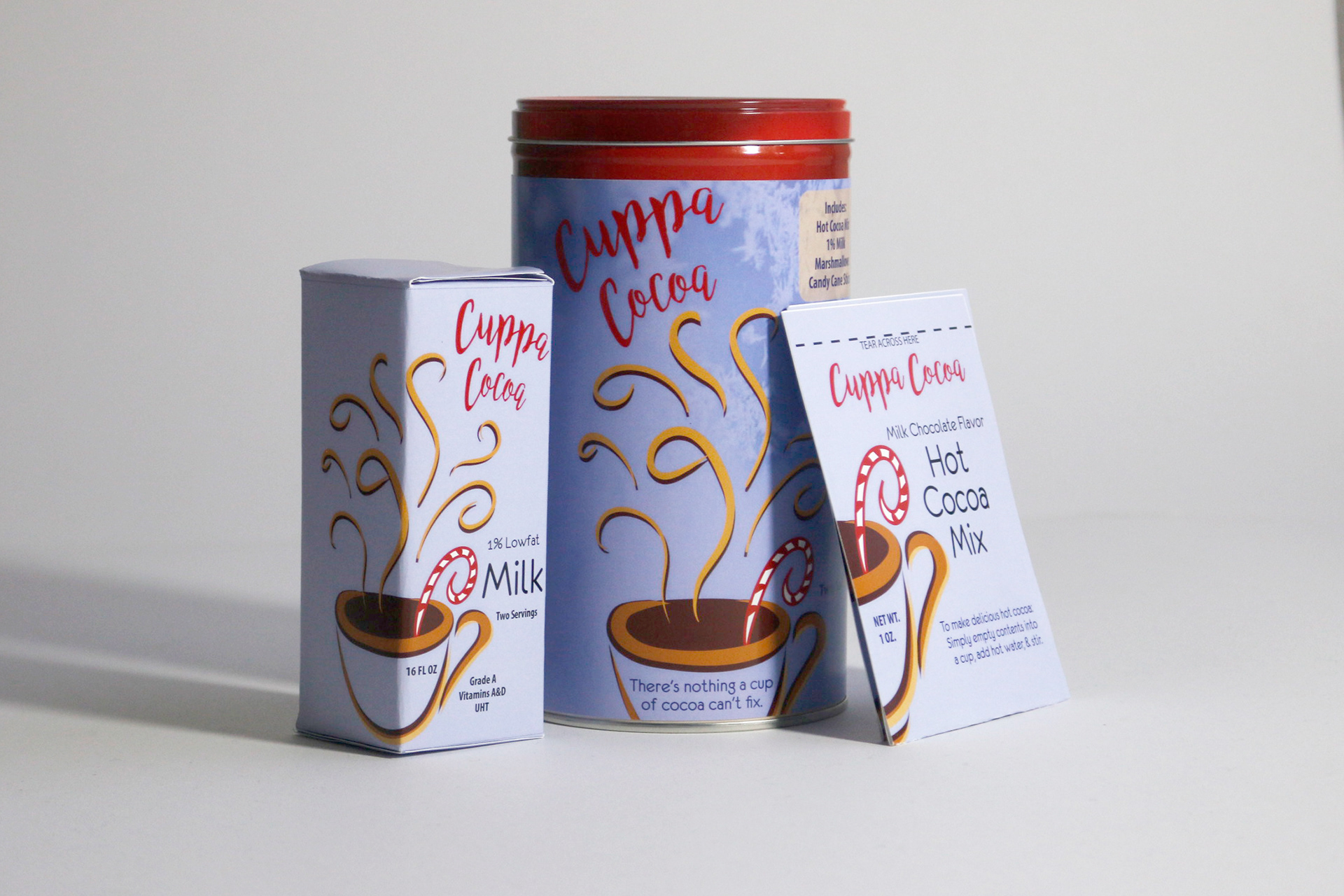
Challenge
Class assignment to redesign a packaged product from the grocery store.
Solution
I chose hot chocolate and decided to make this product into a "Hot Cocoa Kit", which included milk, hot chocolate mix, marshmallows, and a candy cane stick. The original design was very bland and not inviting at all. I decided to use Illustrator to create the hot chocolate illustration, adding the swirls as an organic way to draw the viewer in. I wanted it to feel like looking at a warm, inviting cup of hot chocolate. I added snowflakes in the background of the main container with a cool background, because the hot chocolate pops against the background and brings the viewer in to warm up with it.